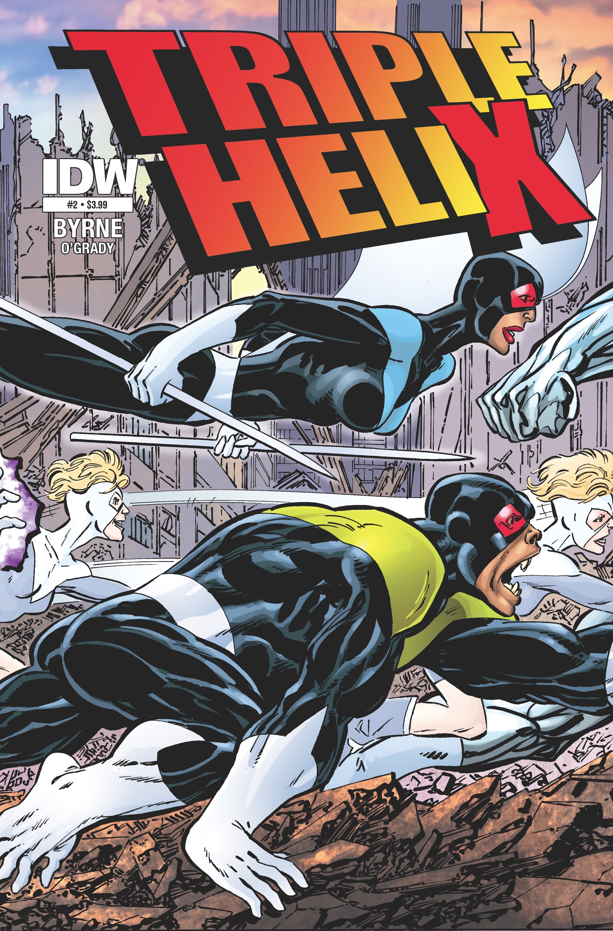
Publisher: IDW Publishing
Writer: John Byrne
Artist: John Byrne
Release Date: 13th November 2013
It’s hard to tell if Triple Helix is supposed to be a spoof. Everything from the book’s logo to the character design is lifted directly from Marvel titles, and the dialogue is actually groan-inducing. In true X-Men-at-its-worst style, we also get a combination of thought bubbles AND characters thinking out loud. It’s bad soap opera-tastic.
John Byrne draws a decent comic, and the layouts suit the almost non-stop action really well, but the artwork here does still suffer from serious flaws in the form of badly proportioned characters, and again, lazy character design.
Triple Helix looks and feels like a below-average 90’s title, and if that’s up your street, then great, you may get some enjoyment from this, but I really don’t know what this book is, or wants to be. Is it drawn and written that way to pay homage, or to take the piss?
There’s no doubt that John Byrne is a comics legend, but in today’s rich comics landscape, Triple Helix is painfully sub-standard, and the weight of Byrne’s name is likely the only thing carrying this book to print.
Rating: 2/10.
The writer of this piece was:  Alan Shields (aka Al)
You can also find Al on Facebook

Leave a Reply