Publisher: Image Comics
Writer: Joe Keatinge
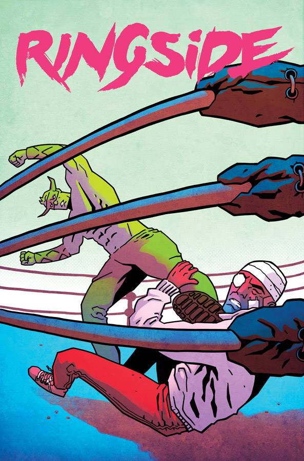
Artist: Nick Barber, Simon Gough (Colours)
Release Date: 24th Feb 2016
Aside from a few exceptions (I’m looking at you ‘Closer to Heaven’), the tag-team of wrestling and comics, hasn’t as yet made a noteworthy title run. Then it was announced that Joe Keatinge and Nick Barber would set a noirish crime drama against the backdrop (ahem!) of professional wrestling, and it finally seemed like we might have a team who could make it work.
As a massive pro-wrestling fan (especially the golden age of the mid ‘80s to mid ‘90s), I was sold on the idea before it hit the shelves, but in all honesty, I didn’t expect the series to be so engrossing, and actually improve with each issue. Keatinge has this wonderful talent for creating characters who suffer from varying degrees of hubris, whom he drops into situations way out of their control. Only through seeking help from those more qualified to deal with the harsh realities do they grow, but not before taking many steps backward in the process.
Danny Knossos is a captivating central character, who embodies those traits. His wrestling alter-ego of a Minotaur is aptly symbolic, given his hard-headed and stubborn nature, prone to rushing headlong into situations he’s ill-equipped to handle. He’s been battered from pillar to post thus far, and in this issue he is trusted with performing a simple enough task, but chooses to complicate matters further in a stunning climax.
Running parallel is the story of Reynolds, whose trajectory is the mirror image of Danny’s. With one attempting to make his way in the business and the other on the way out, their paths are sure to cross in a more meaningful way somewhere along the line, but Keatinge is very cleverly keeping his cards close to his chest.
This dual narrative is further defined in the art; and in particular, Simon Gough’s colours, with more natural hues for Reynolds story, and a fascinating mix of palettes for the various periods in Danny’s career. In his present, a muted, garish neon tone perhaps symbolises the distant, fading spotlight as well as the seedy underbelly he finds himself in. By contrast, his early years are cast in warmer golden tones, perhaps reflecting how he saw his future, and overall it’s a shining example of how important colours can be in helping convey a narrative.
To top things off, the simple, rugged art of Nick Barber works perfectly for this series, imbuing each character with just enough detail to tell their individual story. These people are not the superstars of wrestling, so the choice to make them a little more abstracted, as opposed to polished and god-like makes perfect sense. The power of his work, though, is in the subtlety of his storytelling, which accentuates Keatinge’s story beats through facial expressions, body posture, and POVs. It brings a cinematic quality to the story, ensuring it flows effortlessly from cover to cover.
Yeah, so it might be no secret I love this series, but it’s certainly not just for wrestling marks like me. The creative team have struck gold here, and I think this title reign will last a long time.
Rating: 5/5
PREVIEW ARTWORK
[Click to Enlarge]


 The Writer of this piece was: Martin Doyle
You can follow Martin on Twitter

Leave a Reply