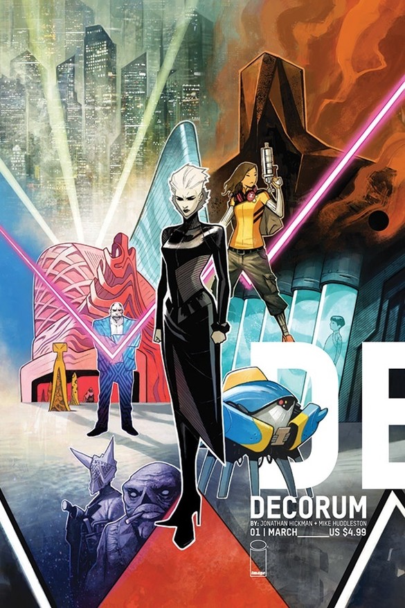
Publisher: Image Comics
Words: Jonathan Hickman
Art: Mike Huddleston
Lettering: Rus Wooton
Release Date: 11th March 2020
Decorum, a brand-new Image Comics series on sale this week from Jonathan Hickman and Mike Huddleston, lays out the scope of its world-building from the very first page; an all-text summary of the state of the galaxy and the myriad attempts at setting up “Preserves” – where a planet’s inhabitants are kept in a basic approximation of their original habitat – an undertaking which has had decidedly mixed, and frequently genocidal, results.
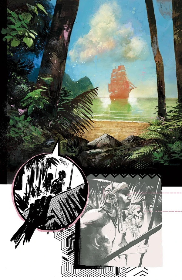
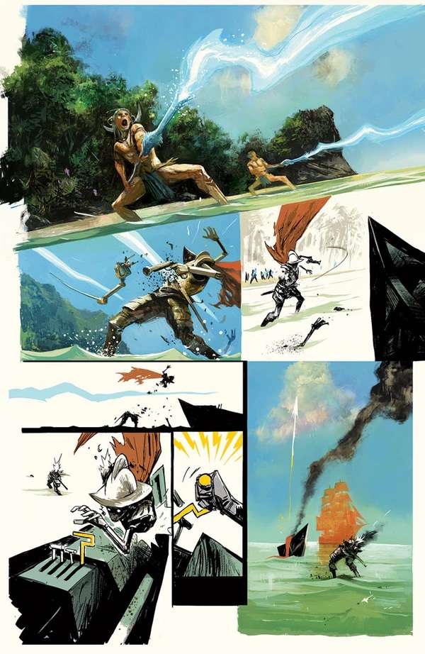
From here, we go to a wordless – or wordless in English, at least – opening skirmish as a planet is overwhelmed by the immensely powerful obsidian beings, their native defences being easily dispatched and their invaders/colonisers instantly setting their sights on a relic of seemingly immense power.
It’s admittedly a little tricky to follow and contextualise at times, with Huddleston’s intentionally chaotic artwork and rapidly shifting (and occasionally disappearing) colour palette making the whole thing feel like a mish-mash of storyboard, dreamscape and surreal experimentation. The effect is admittedly striking though, in spite of its disorienting qualities.
Thankfully, the remainder of the book adopts a far more conventional narrative approach, as young courier Neha is tasked with delivering a package to “The Bouweriz”, a renowned danger spot. The fact that she’s being offered triple her usual rate is enough to give her pause, but when she’s able to negotiate that up to quadruple, she decides that it’s worth the risk. After all, she certainly needs the cash.
Unfortunately, her delivery puts her slap-bang in the middle of a violent altercation between a remarkably polite assassin and a sleazy crime boss – brought to the page in scintillating fashion by Huddleston. There’s a real cinematic dynamism to the visuals, and the way Huddleston plays with colour, style and different types of media on the page, with the bulk of the artwork being black-and-white and the colours themselves being used to add punctuation, really helps to give Decorum an utterly distinctive aesthetic.
Nobody writes a comic book quite like Jonathan Hickman, for better or worse, and while the exposition here is delivered in a typically unwieldy fashion (read: chunks of text and intentionally confusing, encyclopaedia-style excerpts slotted in between chapters), the striking artwork and strong characterisation of our two female leads is more than enough to keep the pages turning, and – in my case, at least – to make sure I come back to check out issue two. Well worth a look, particularly if you’re already a fan of Hickman’s distinctive style.
Rating: 3.5/5.
[PREVIEW ARTWORK – CLICK TO ENLARGE]


 The writer of this piece was: Craig Neilson-Adams (aka Ceej)
Article Archive: Ceej Says
You can follow Ceej on Twitter

Leave a Reply