
Publisher: ComiXology Originals
Writer: Scott Snyder
Art & Colours: Francis Manapul
Letters: Andworld Design
Release Date: 16th November 2021
Clear is a fabulous science fiction thriller from Scott Snyder and the team which manages to bring some interesting ideas to what can often be seen as a crowded market. Whilst there are many similarities or nods to the likes of Gibson, Dick, Asimov et al. this feels like the spirit of the genre, as a vehicle to explore broader questions, is well and truly captured.
The basic premise is that some point in the not-too-distant future, neural interfaces progress such that it is possible to override one’s optics and effectively make the world look how you’d like it to. Fancy yourself as a fantasy gamer? Well, you can see all the buildings as castles and forts and other pedestrians as orcs or goblins.
Maybe you fancy sleek aesthetics? Or maybe, and more sinister, you can change how you see your partner or family…
Given the money exchanging hands for ‘skins’ in online gaming, this concept of ‘veils’ here doesn’t seem as farfetched as it might otherwise.
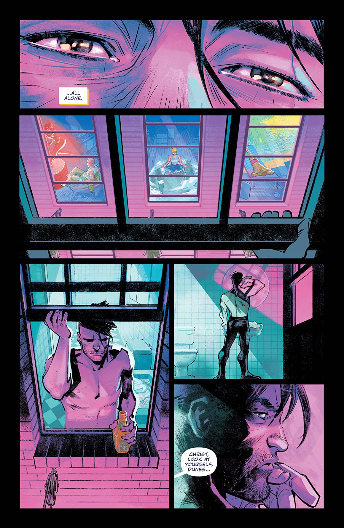
Plot wise, the arc follows Detective Sam Dunes, a Clear, or someone who doesn’t use these veils and pays to see the world in all its true grimy dystopian visuals. Working to root out those trafficking in black market tech, Dunes is every part the hard-bitten noir gumshoe. Throw in a connected murder, a femme fatale, as well as gangsters, and you’ve got a heady mix of potential.
The artwork is tight and engaging throughout. Manapul seems as comfortable with rainy cityscapes as they are with vehicular chases or expressive characters. The concept of the veils is portrayed very effectively. I had first thought that I would have preferred to see some gonzo ‘in your face’ cutaways to really drive home the myriad visuals that must exist. Upon reflection though, the way we experience it here still manages to deliver this but is probably far more in keeping with the overall tone. The colouring weaves hints of neon with subtle, dingy drudgery which, along with the lettering, provides a pleasant read where the challenge comes from the story.
So where are we now with the second issue?
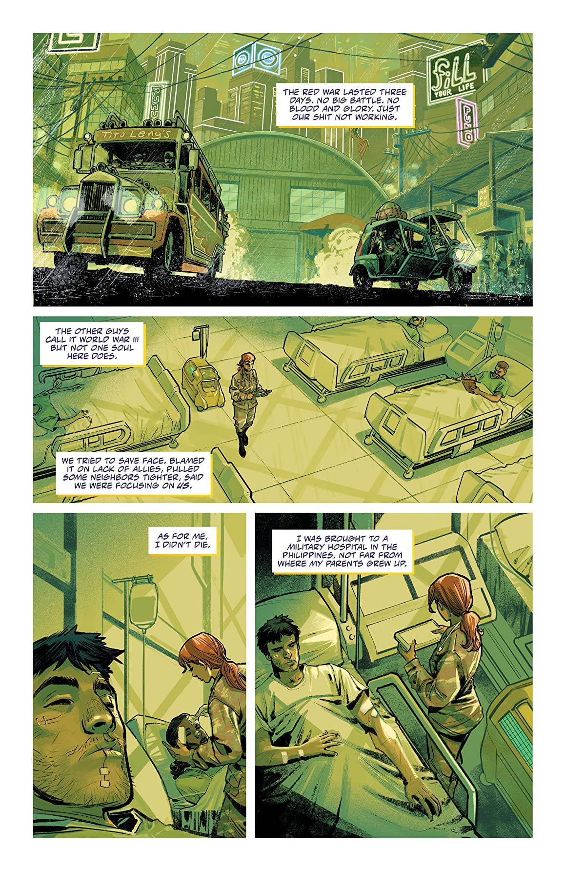
All the good stuff I mention above carries over so there’s thankfully no drop in standard. I always expect a touch of world building and history with stories like these and was happy to see this in the opening panels. What better way to start than with a world war? Deftly summarised in but a few pages, the opening here maintains that use of the sci-fi genre to push or prod us into related questions. Here we fight and rail against a decline in the West with a tech war that was over before the first round was ever fired.
This second issue builds up the layers needed for a good noir or whodunnit, introducing the power behind the technology, and pounding towards another gripping cliff hanger. I have made the comment in the past that certain arcs seem to be written with the trade format in mind. Here though there’s no holding back and my only concern is how the team will be able to do this every issue?
If you’re looking for something which combines cerebral storytelling and visually stunning action, then you could do a lot worse than what’s on offer here.
Rating: 4/5.
[PREVIEW ARTWORK – CLICK TO ENLARGE]

The writer of this piece was: Adam Brown
Adam Tweets from @brother_rooster

Leave a Reply