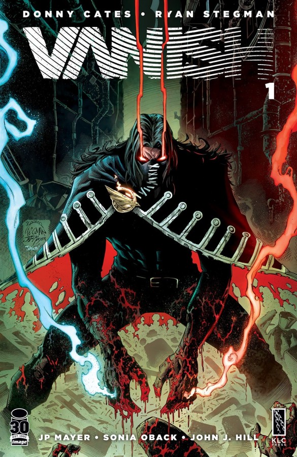
Publisher: Image Comics
Writer: Donny Cates
Artists: Ryan Stegman (pencils), JP Mayer (inks)
Colorist: Sonia Oback
Letterer: John J. Hill
Release Date: 21st September 2022
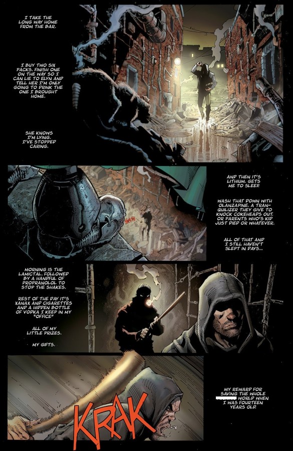
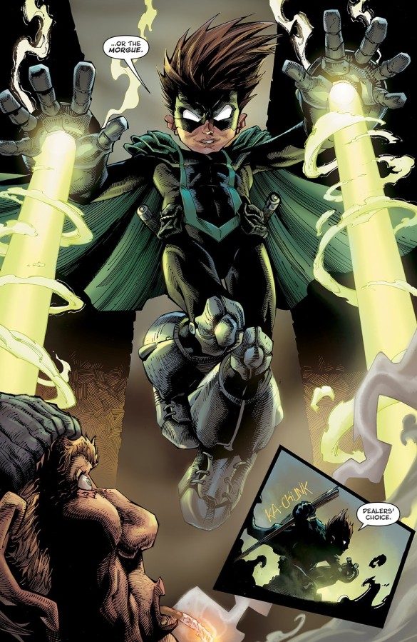
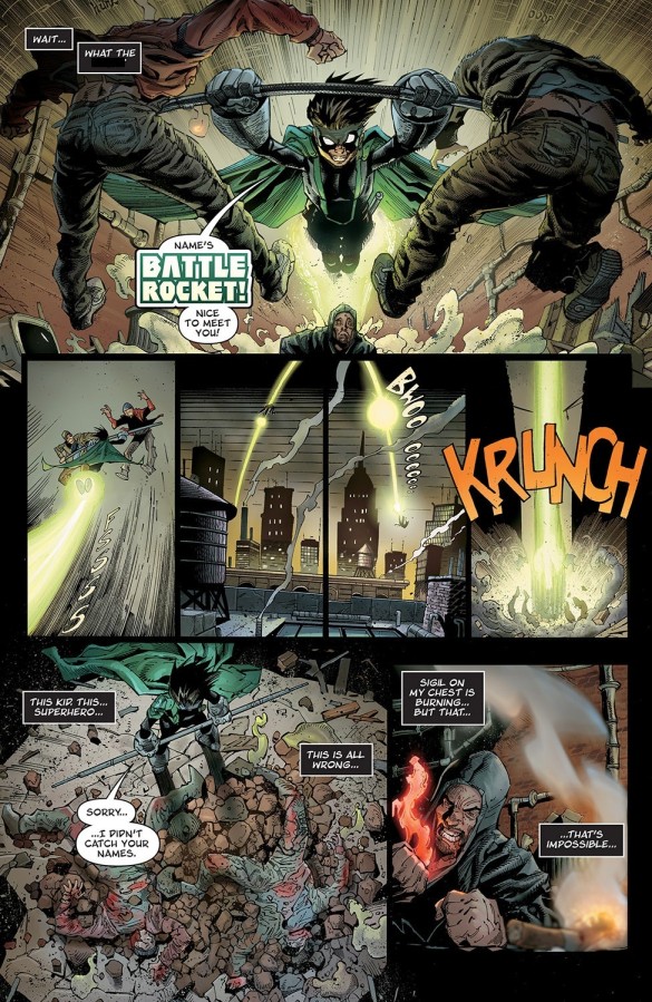
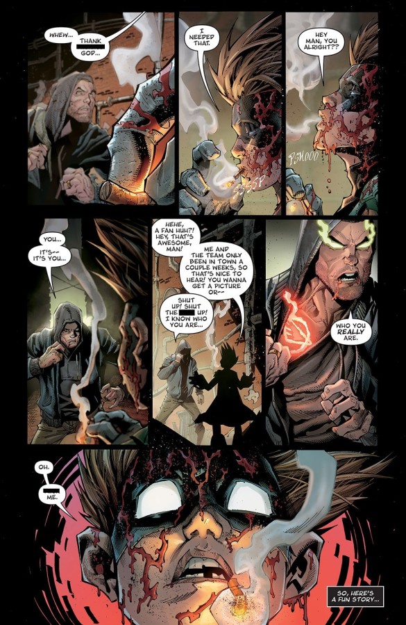
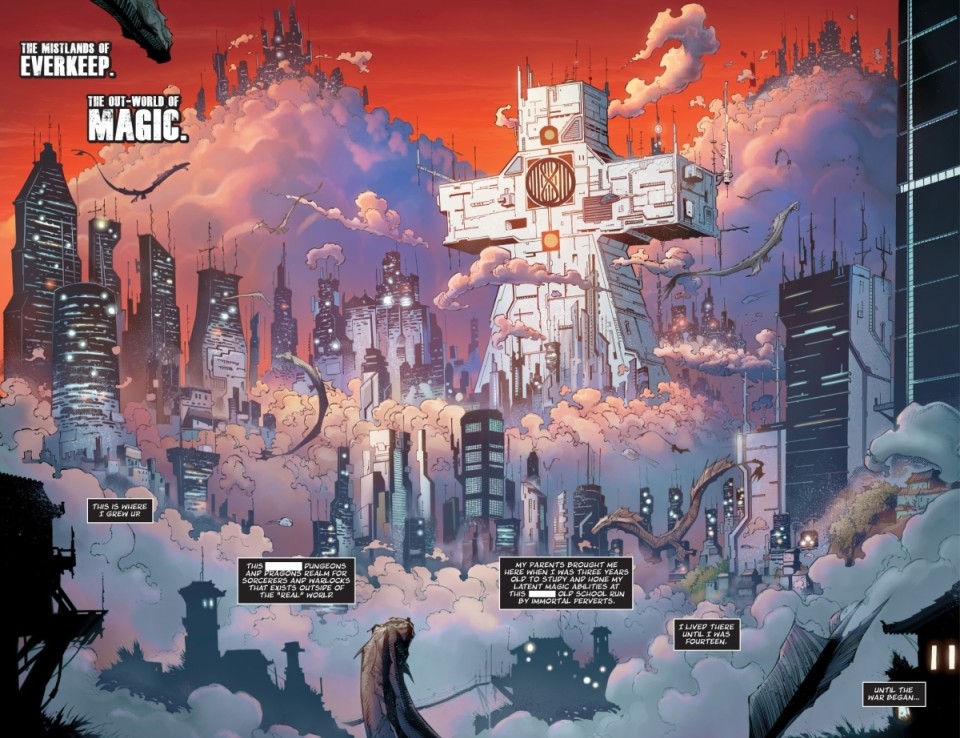
On sale this week from Image Comics, Vanish is the latest collaboration from the critically-acclaimed Venom creative team of Donny Cates and Ryan Stegman. The first issue introduces us to Oliver Harrison, a former hero who once saved the entire world when he was just fourteen years-old, but who now spends his time self-medicating with a heady cocktail of drugs, alcohol and anything else he can get his hands on. Child stars, amirite?
As anyone who’s followed the Big Comic Page for any length of time will attest to, I’ve been a huge fan of Cates’ work since The Paybacks back in 2015, and always make a point to check out pretty much anything his name is attached to. And this series certainly has a lot of his trademark flair, from some of the most realistic dialogue you’re ever likely to read to cinematic page-turn reveals and slick narrative flourishes aplenty.
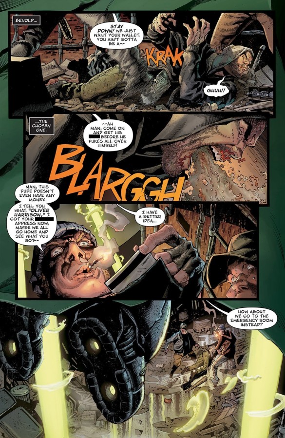
On the visual side of things, Stegman and inker JP Mayer do a truly fantastic job with the artwork, as you might expect. Everything is immaculately presented, packed with depth, detail and solidity, and some of the key visual beats and moments of violence are air-punching awesome. Credit also needs to be paid to colourist Sonia Oback, who fleshes out things beautifully, keeping things vibrant enough while still remaining suitably gritty.
So yeah, the execution is polished and the structure is undeniably tight, but for me, there’s simply nothing here that stands out in any significant way, which is a bit of a disappointment considering the hype behind it. Everything you see here is something you’ve undoubtedly read before, and mashing these tropes together with a drug and profanity-laced sheen doesn’t make them any more interesting. The leading man feels like he should be a lot more interesting than he actually is, but there’s something about him that just doesn’t connect. Hopefully this will shift as the series progresses, but the initial impression isn’t a particularly strong one.
On paper there’s certainly a lot to like here, but if I’m being honest, the bulk of my excitement about this series is based on the track record of its creative team, as opposed to what actually happens in this first issue. Don’t get me wrong, it’s not bad in any significant way, its just a little bland, particularly when you compare it to the creators’ previous work, both individually and together. One to keep an eye on if you’re a hardcore fan of the creators, but this definitely isn’t setting the world on fire.
Rating: 3.5/5.
[PREVIEW ARTWORK – CLICK TO ENLARGE]
 The writer of this piece was: Craig Neilson-Adams (aka Ceej)
Article Archive: Ceej Says
You can follow Ceej on Twitter

Leave a Reply