Publisher: Dynamite Entertainment
Writer: Victor Gischler
Artist: Andrea Mutti
Release Date: 13th November 2013
Victor Gischler is no stranger to the world of detective fiction. He made his name writing crime fiction novels, although comicbook fans may know him better from his work on Punisher, Deadpool and Wolverine. Oh, and lets not forget The Death of Dracula one-shot and the proceeding X-Men series, although the less said about that the better. It’s no surprise then that Dynamite entertainment tapped Gischler to write the adventures of one of the most influential pulp characters of the 20th century. More than 70 years after his inception, does The Shadow still hold up next to those he influenced?
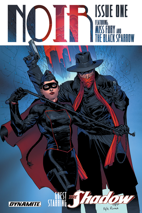
Let’s deal with the elephant in the room – It’s difficult to not see The Shadow as an imitation of Batman. On the surface the only real distinction between the two is that the Shadow kills, and the Batman doesn’t. I found I had to keep reminding myself that Batman is actually the one who is imitating The Shadow. Bill Finger himself freely admit that Batman was initially conceived as a Shadow take-off. Sharing the cover with The Shadow is Black Sparrow, an original creation by Gischler – she is the Catwoman to The Shadow’s Batman, the Adler to his Holmes. The first issue does a great job of catching the reader up on the history between Sparrow and Shadow. Given that this is my first exposure to either of these characters I felt I had a good grasp on the dynamic between the two. A pulp-noir story lives or dies on the strength of it’s mystery – and that’s were this issue has let me down. The main thrust of the plot revolves around a mysterious object known as “The Moon Stone” which seemingly has connections to the Knights Templar and ancient mysticism. Unfortunately we don’t get enough information about the stone – or those who are seeking it – to pique my interest in the resolution to the story. Hopefully this will be rectified in issue 2, but it seems like a critical failure that the first issue lacks the intrigue required to draw me into the series as a whole.
Andrea Mutti’s art is fitting for a pulp-noir story. The pencils are slightly rough around the edges, giving the book a gritty feel and the inks add the moody, dark feel that is so synonymous with the genre. Unfortunately the colours by Vladmir Popov go some way to disrupt the mood that Mutti is trying to achieve – they’re a little to vibrant to serve a noir story. It could be argued that they are trying to blend the noir and superhero genre’s by using the colouring to make the pages pop but if that is the case then it’s an experiment that simply hasn’t worked. They by no means ruin the book, but I can’t help but feel the book would have been better served as a black and white endeavor – although from a business point of view it’s understandable why Dynamite would want the book to be done in colour.
There’s little to draw me in to the next issue – even the last page reveal of one of the first female superheroes – Miss Fury – means little to me, especially since the series is billed as a team-up between Shadow, Sparrow and Fury. I hope the series picks up steam in the second issue as there is a lot of promise and potential here for a dashing noir adventure but unfortunately I’ll have to give the book a 4/10. Mutti’s art is the highlight of the book but the rest fails to deliver.
Rating: 4/10.
The writer of this piece was:  David McIntyre aka (Big Dave)
You can also find David on Facebook

Leave a Reply